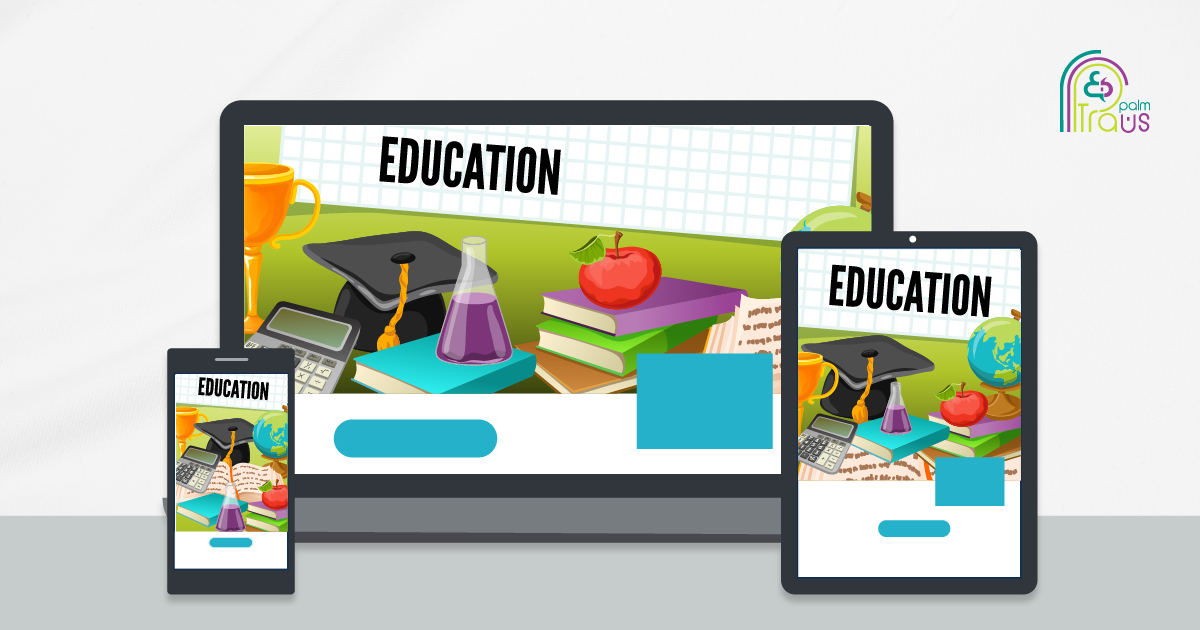
The days of strict classrooms and inflexible schedules are gone. Now, learners can access training and educational content on smartphones, tablets, desktops, and laptops, all from the comfort of their own cozy corner, at their own desired pace, and in a way that suits their distinctive learning style.
If you are planning to design responsive courses on Lectora, continue reading to explore how you can make the most of Lectora to create online responsive courses that are both visually appealing and functional on any device.
Let’s start!
Understanding Responsive Design in eLearning Authoring Tools
Responsive design guarantees that course content adapts seamlessly to different screen sizes and orientations for an optimal learning experience, eliminating the need to create separate versions for each device.
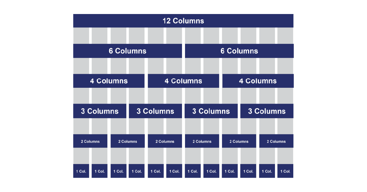
Responsive Course Design (RCD) applies the fluid grid concept. Lectora’s fluid grid system divides the screen into 12 grids with five breaking points.
Grid percentage-based layouts enable designers to adjust content placement so that elements adapt proportionally when scaling between devices.
How Lectora Handles Responsive views
There are 5 default views for different screen sizes in Lectora, including:
- Desktop (full-size screens)
- Tablet Landscape
- Tablet Portrait
- Phone Landscape
- Phone Portrait
The process primarily starts with building the design for the desktop view of your course. This means you choose the layout, arrange elements (like text, images, and buttons), and decide on the overall look for an optimal display on larger screens like desktops or laptops.
Once you have set it up for the desktop, Lectora automatically adjusts the layout for smaller devices, such as phone and tablet views.
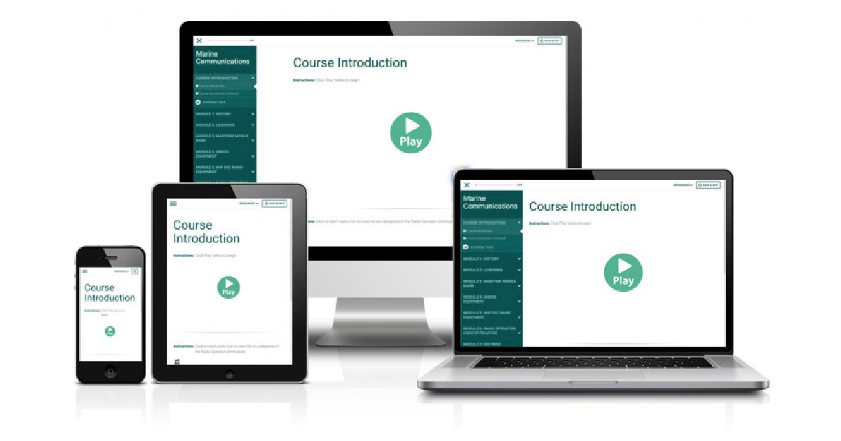
At the top of Lectora’s interface, you can use the device selection bar to switch between device views and visualize how your course will appear on different devices for any necessary modifications.
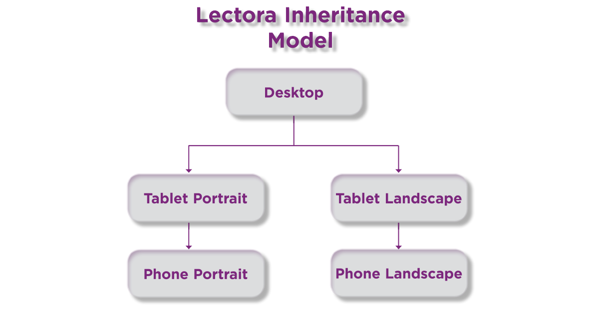
With Lectora’s inheritance model, the layout and properties you define in the desktop view cascade to the tablet landscape view, while changes made in the tablet portrait view influence the phone portrait view.
However, you have the flexibility to resize, reposition, or even remove an object from any view when needed. For example, you might adjust text size, change object color, or remove an object on a phone to improve usability and readability.
Best Practices for Designing Responsive Courses for Lectora
A) Working with Text
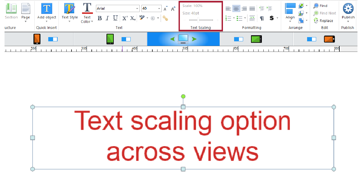
Use the Text Scaling option to keep the text readable and consistent across all views, but its size can adjust for smaller screens based on the device type.
The text scaling feature allows setting a certain percentage for the text. For example, on the screen below, you can see the text size is 40 pt in the desktop view.
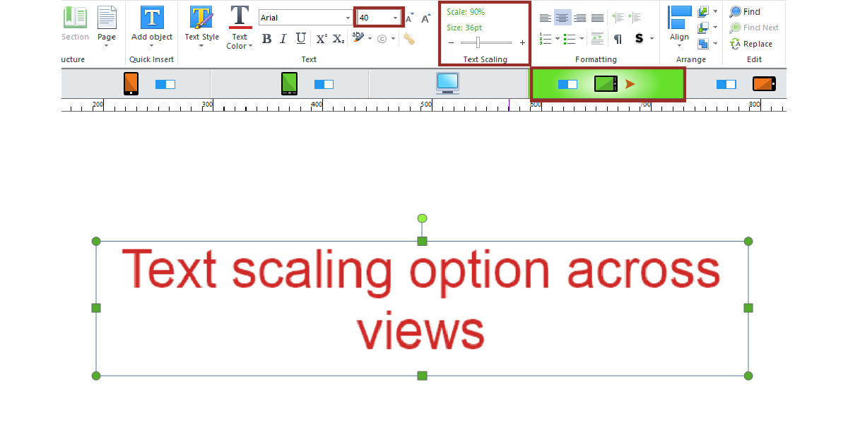
The following shows that the text size in the tablet view has been reduced to 90% of its original size as it would normally appear in the desktop view.
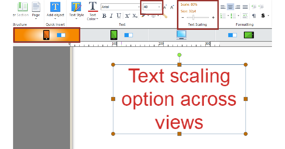
The one below illustrates the phone portrait view, showing the text size is at 80% of its original size.
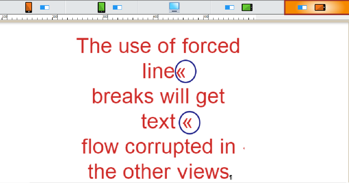
Avoid forced line breaks, which occur when you manually insert breaks in your text, often by pressing Enter or Return to move the text to the next line.
Although these might seem useful for formatting, it can distort the natural flow of the text in smaller devices.
It can also result in overlapping text or unintended gaps after localization, which might affect readability.
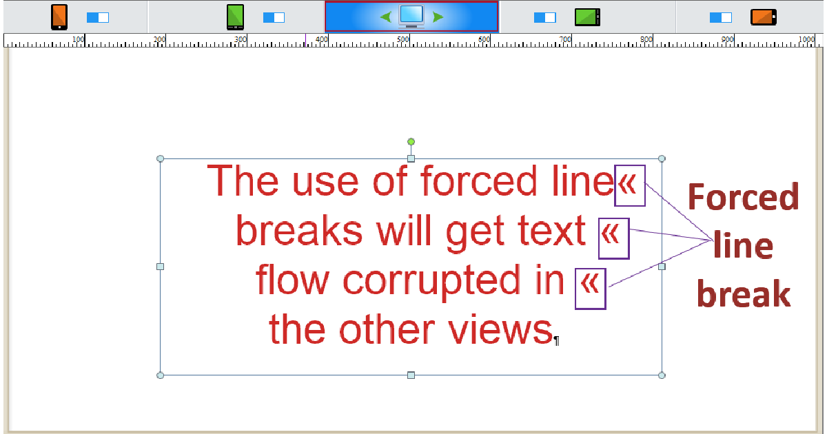
The following snapshot demonstrates the forced line breaks in the Phone Landscape view can lead to improper text flow.
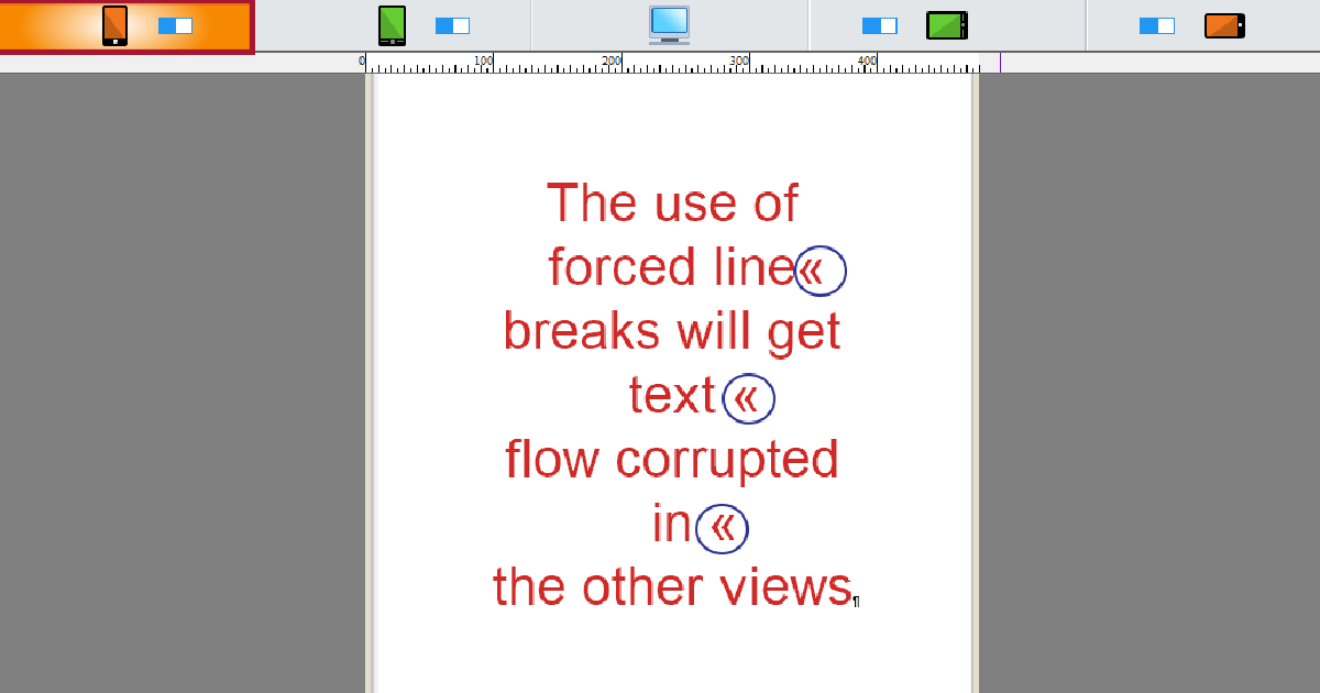
In phone portrait view, the text appears poorly formatted due to the forced line breaks, as shown in the following.
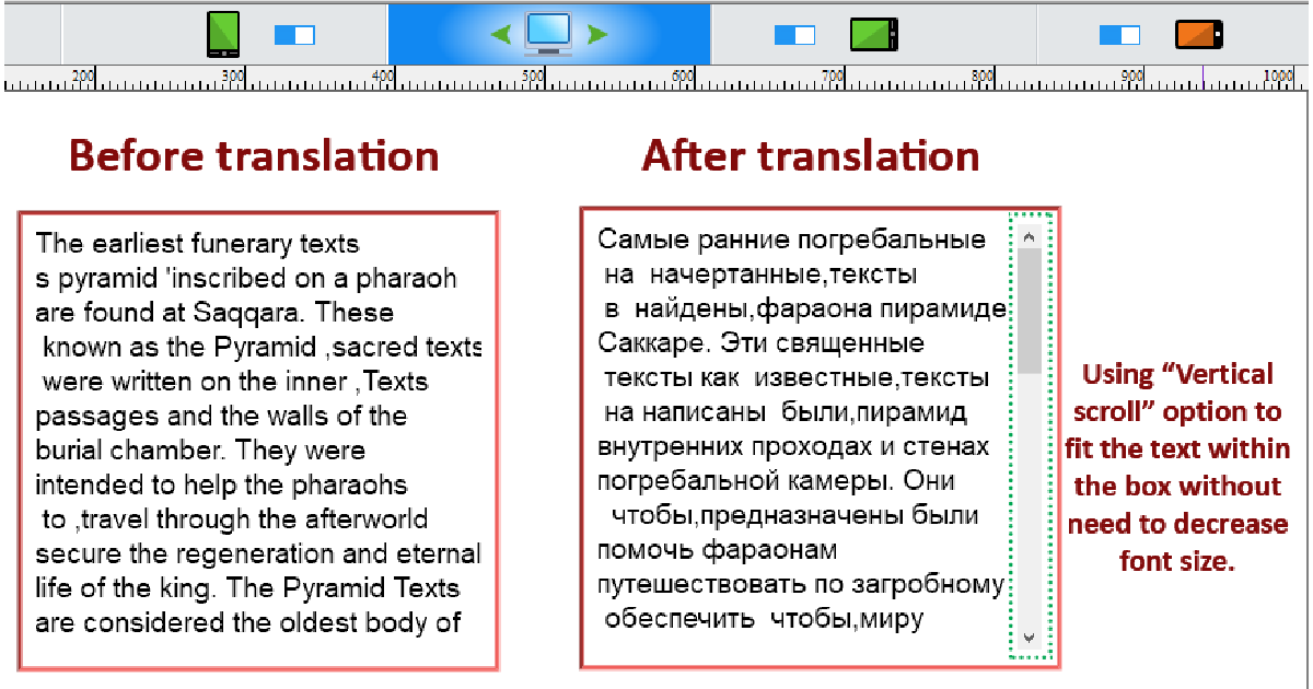
Consider using the Vertical Scroll option if you have a large amount of text that doesn’t fit well across views. This is especially useful for localized courses in languages that tend to expand. It helps save space and avoids the need for excessive text scaling. Check the example below.
B) Working with Images
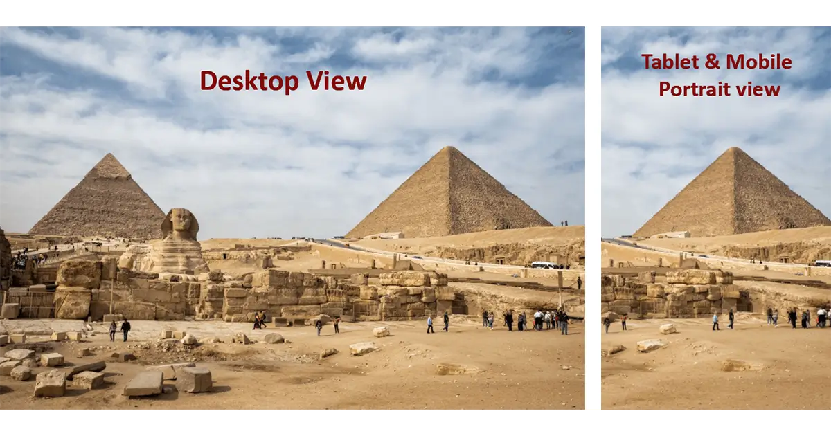
Select the correct background images that won’t get deformed when displaying on other devices.
For images with nature, animals, human faces, or landscapes in the background, think of focusing on only part of the image in the other views.
Take a look at the following example, where the background has been tweaked to match the tablet and portrait views.
 Activate the Maintain Ratio option to keep the image’s correct proportions when its size is adjusted across different responsive views without altering the aspect ratio.
Lectora Inspires responsive views by automatically modifying the image size for different devices. However, on smaller screens, images may not fill the entire screen.
To fix this issue, you may revert to the aforementioned solution of focusing on a specific part of the image.
C) Working with Objects and Layouts
Use the Offset from Bottom option to maintain consistent object and images positioning at the same place relatively from the bottom of the page across views.
For design or space-saving purposes, consider moving unwanted objects outside the page borders, instead of deleting elements from one of the views, which removes them globally.
Use the Anchor Position option to prevent objects’ moving when the user scrolls down in portrait views.
Lectora Responsive Design Considerations for Localization
Creating eLearning courses in multiple languages can be costly, time-consuming, and inefficient for large companies aiming to develop training and educational content for a global audience of customers and employees.
Here are certain key tips any organization should take to achieve fewer bumps in the road and greater start-to-finish efficiency in localization.
Consider Language(s) Orientation
Use a universal design that works well for both left-to-right (LTR) languages (e.g., English) and right-to-left (RTL) languages (e.g., Arabic).
Additionally, consider other elements like text alignment, navigation, and overall layout so that your content operates smoothly for an international audience, regardless of the language they speak.
Bullet points and numbering lists in Lectora responsive design complicate the process of translation and localization, potentially disrupting the structure of your eLearning course.
For this reason, it is recommended to limit the excessive use of these elements, particularly when localizing the course into RTL languages, as Lectora doesn’t handle their formatting well in such cases.
Leave Space for Text Expansion
Make sure there is ample space in the design so the text can expand without issues. This is even more critical in Lectora responsive design development to reflow text and other elements across different views.
For instance, some languages like Arabic and German require more space than English, so developers must account for text expansion and shrinkage when translating the original course into other languages.
Why Lectora Excels as a Responsive eLearning Authoring Tool
Lectora’s responsive capabilities are the best eLearning authoring tools for mobile learning and the ideal solution for other multi-devices. Fundamental advantages include:
- Device-specific view control for optimized layouts.
- Flexible layout inheritance to reduce design redundancy.
- Comprehensive localization support to secure seamless content translation.
While eLearning authoring tools like Rise 360, iSpring Suite, Adobe Captivate, and H5P focus on automatic responsiveness, Lectora provides instructional designers and developers with advanced customization options to manually fine-tune designs, perfect for intricate learning experiences.
Enhance Your eLearning Courses with Lectora’s Responsive Design Feature
Responsive design matters in eLearning development, and the right authoring tool you choose makes all the difference.
Lectora stands out for its precision, flexibility, and scalability, making it a powerful elearning authoring tool.
We, at TransPalm, deliver eLearning localization services, helping you create customized learning experiences for multilingual courses and training programs.
Check out more responsive design guides and tools to improve your course development process.